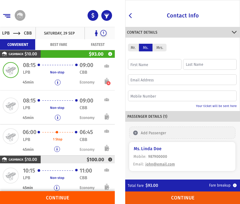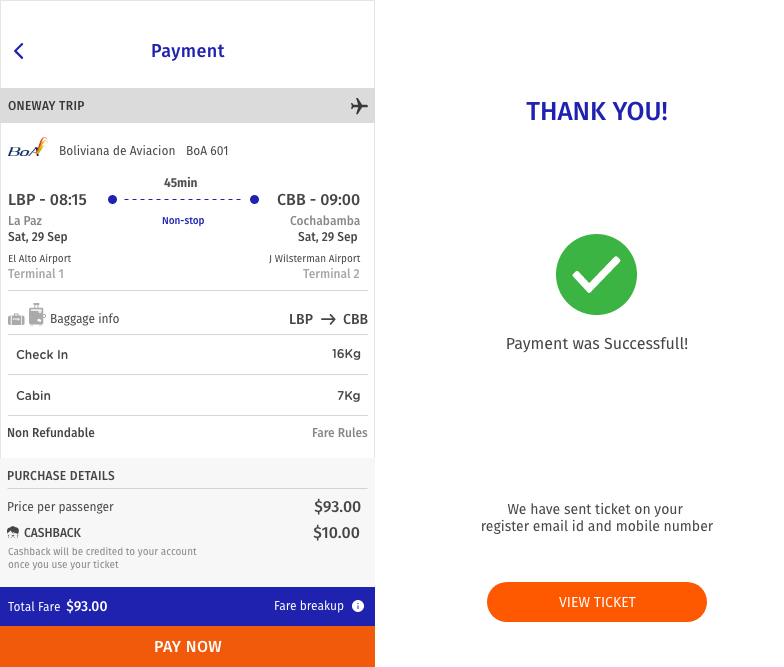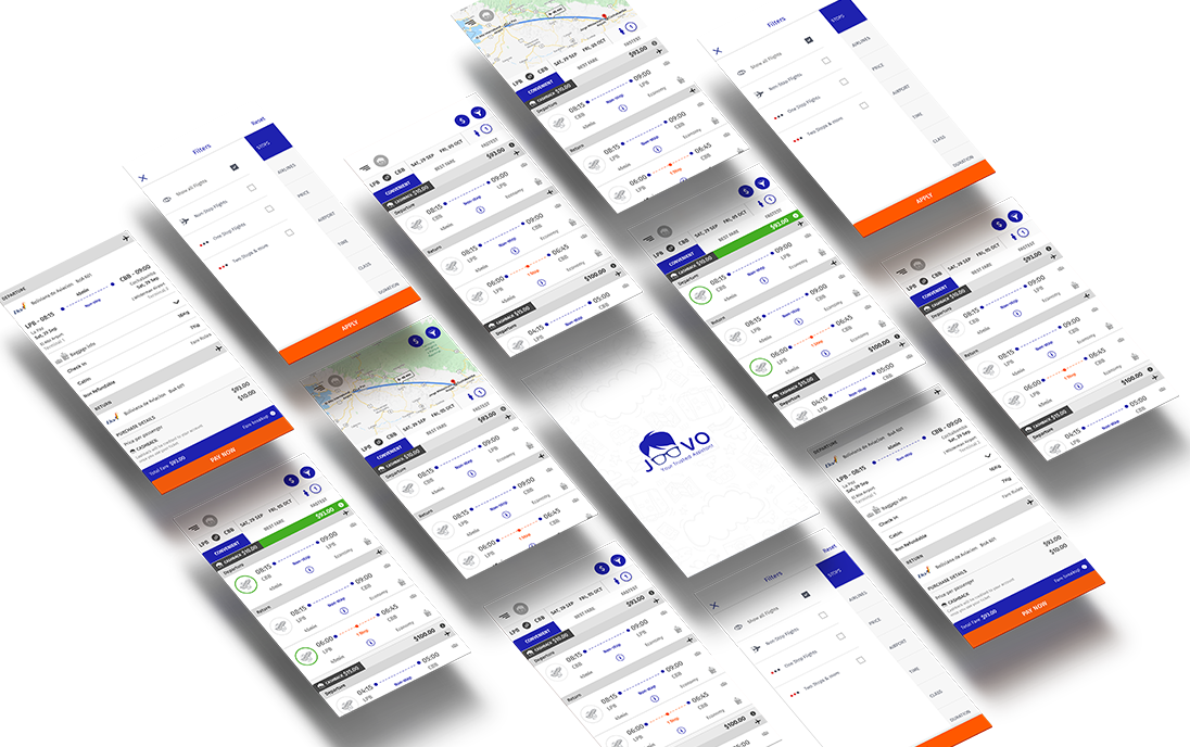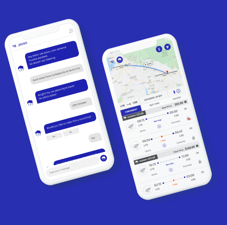
JOOVO
Pocket Assistant
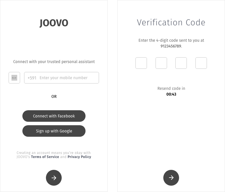
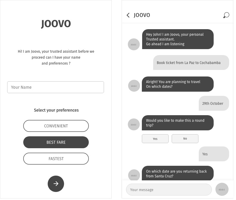
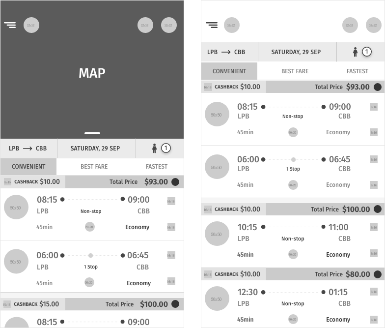
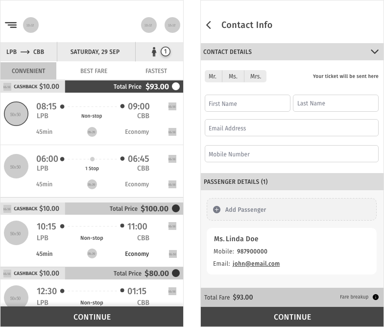
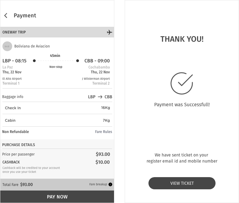
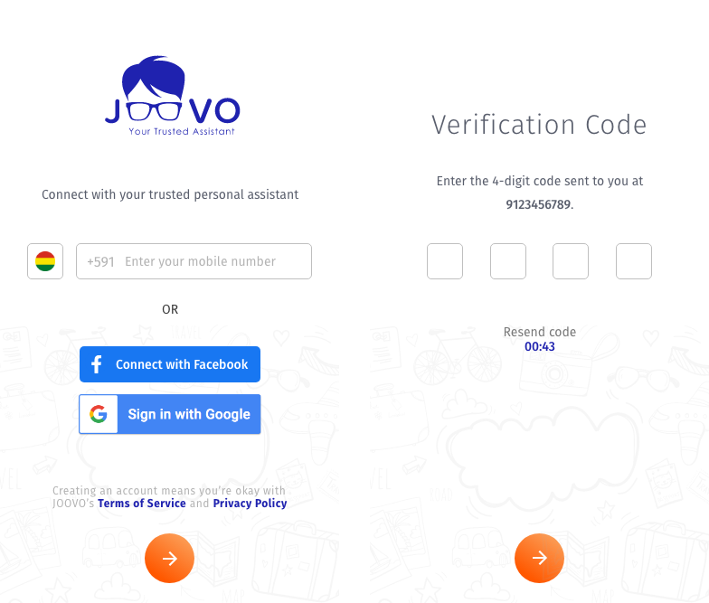
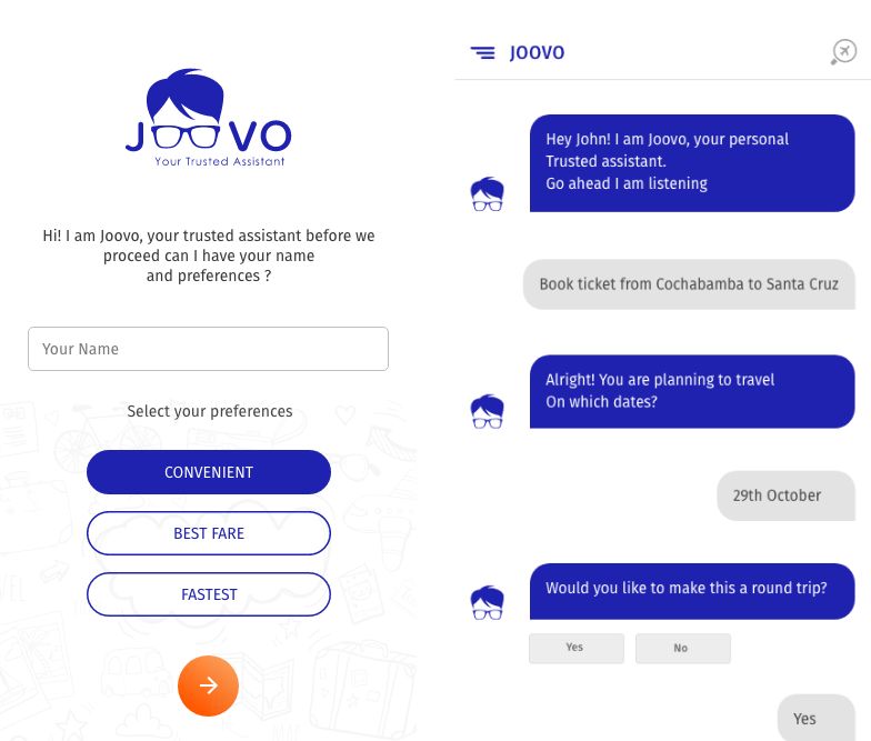
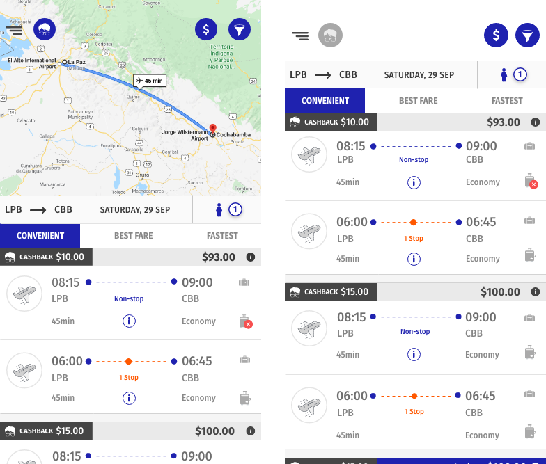
Background One such trusted assistant that gives you all that you desire and more. It takes you to your dream destinations, brings to you the best of fashion available in the market, assists you in your finances, provides you with the chance to pursue your desired lifestyle, and all this is coupled with amazing cashback offers. With this, you will be less Busy and more You.