IKEA

Food Kiosk

Background
A major furniture manufacturer founded in Sweden, and opened its first Japanese store in 2006. Since then, they have opened eight stores in Japan including those in regional cities, and announced its plan to have 14 stores by 2020.

The Briefing

The idea was to have food kiosks in their store across different cities in Japan. The goal was to have a food kiosk, which helps the user to order food after or while shopping at the stores. Users can enjoy their meal at a store restaurant or can opt for taking away as per their convenience.

The store already has an in-house restaurant, but the idea is to have a kiosk in the restaurant is because when a user visits restaurant they can order food without much waiting and kiosk can help them to place an order in advance select their meal and make payment using the same booth and save time by not standing in queues.

The Requirements
  • 1 Design a very simple super easy design flow for user to order food.
  • 2 User will make payment using the same kiosk.
  • 3 Multilingual language support with languages like Japanese, English, Chinese and Korean.
The Research

To begin with, this was something new for me from designing a mobile or web app. I visited the Mcdonalds and looked into their kiosk systems their design was interactive and well-implemented it was good learning as I got to the how kiosk work and what design aspect we have to consider while working on a kiosk. As all know, McDonalds is only into the food business while my client is not into the core food business, and that’s why the comparison between the two was irrelevant.

The Challenge

Our major challenge was to accommodate multilingual features to support languages like English, Japanese, Chinese, and Korean. Also, we had to make sure that when the user changes the language, the user interface should not affect the design. One more challenge was a client requirement to have a more prominent item picture and to have the feature to add quantity without using conventional PLUS and MINUS signs on main item list screens.

The Solution

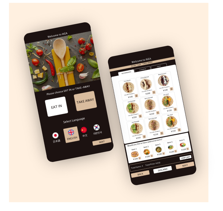
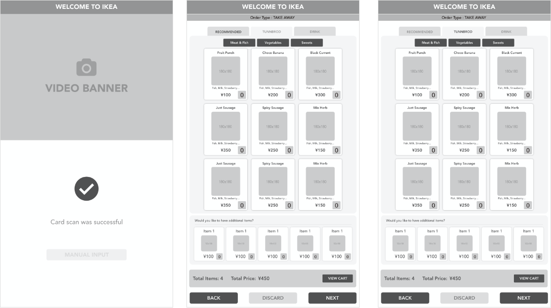
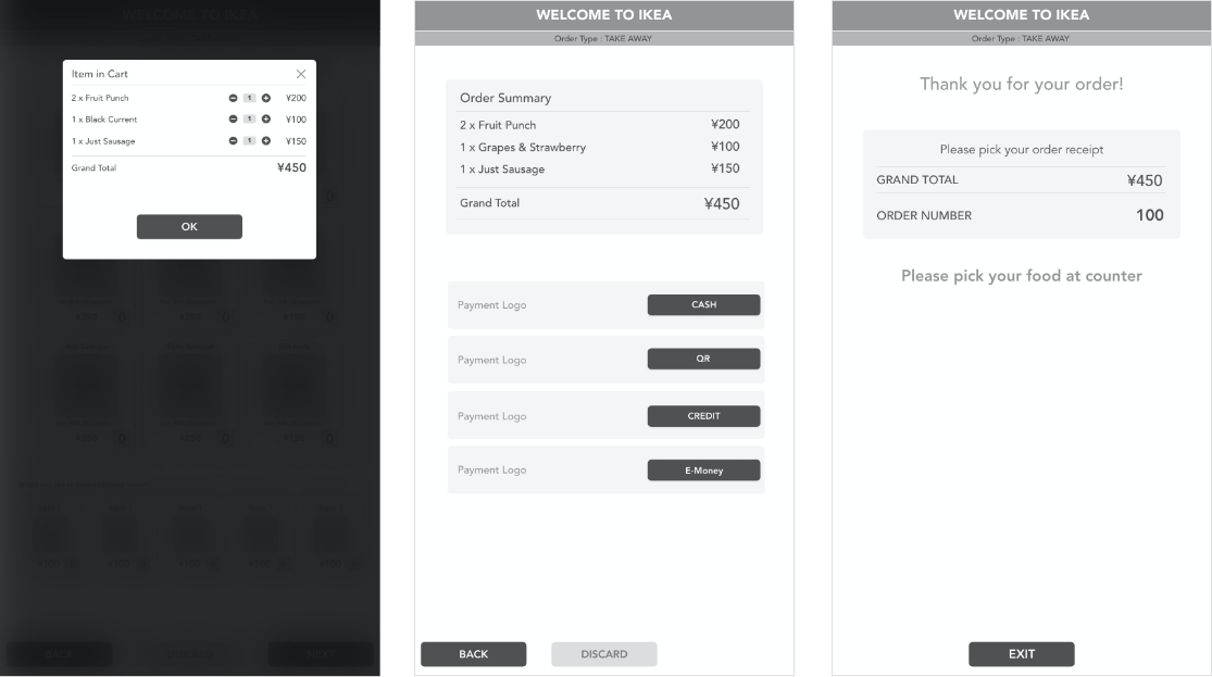
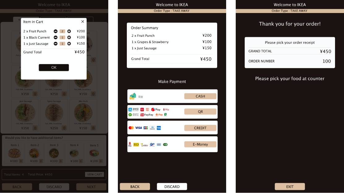
For language support, we used fonts which fit well in all languages and don't affect the design; we also did some minor design changes, but in the end, it worked. And adding items we had some discussion with the client we presented our suggestions and they also came with few of their ideas. Still, eventually, we agreed upon to have a number text box, which will big enough for user to tap on to add items. To remove the item, we put a popup on tap of item image where the user can change the count with the use of conventional PLUS and MINUS signs. We convinced client to use signs in order confirm popup so that if user wants to remove any item they can do it at the same place.

Design Process

I did some brainstorming on the wireframe, and our initial designs were on paper, and then we developed digital wireframe in Adobe XD for our customer to review. Our primary focus was home screen and order selection screen design. If we can get that right, the rest of the screens will flow with the flow.

Paper Sketches
Wireframe XD
Final Design

IKEA

Tokyo, Japan

Customers using KIOSK to order meal at the store.
What did I Learn?

Designing the food kiosk was challenging as this was something very new for me then what I have worked so far. It was clear from the onset that the major challenge will be to make food orders quick and secure along with the support of different language support, which demands to have a design that can support the required language without changing the design.

Final Thoughts

Successfully tested the UI on their kiosk along with customers as a demo and have received very positive feedback and few tweaks from the management and technical team.